
Today we released version 3.0.0. We fixed several bugs in the new layout and migrated some features from the old to the new layout (e.g. you can edit the tags of your posts in the post list again). Furthermore, we improved several web scrapers and added a new scraper for Akadémiai. We also fixed some minor bugs in the core system to provide a better user experience and system performance.
We are happy to announce that all BibSonomy modules are now open source. You can find the source code on Bitbucket. Moreover, you can find all compiled modules in our Maven repository (http://dev.bibsonomy.org/maven2) including a source distribution.
Happy tagging,
Daniel
Showing posts with label layout. Show all posts
Showing posts with label layout. Show all posts
Wednesday, November 26, 2014
Thursday, August 21, 2014
ThrowbackThursday
As we are about to release a new design for BibSonomy, we would like to show you a bit of the beginnings of our system. When it started out in 2006 the website looked a lot like today and still totally different:

The first publication on BibSonomy was also published in 2006 as was the very first blog post.
At the moment we are testing the new bootstrap layout, which will hopefully be released soon:

So stay tuned and keep tagging!
Lena
The first publication on BibSonomy was also published in 2006 as was the very first blog post.
At the moment we are testing the new bootstrap layout, which will hopefully be released soon:
So stay tuned and keep tagging!
Lena

Sunday, August 3, 2014
BibSonomy gets a new front-end
We're currently working hard on a new user interface for BibSonomy. In the past, we've had lots of hints on how to optimize the layout, accessibility, and usability. We're scientists and programmers but we aren't product designers or experts of human computer interaction. So we've decided to use a framework that helps us to implement all these necessary improvements.
There are lots of front-end frameworks out there. We’ve chosen Bootstrap for the following reasons:
The aim of a new front-end is to achieve an easier way to interact with BibSonomy. For this, we’ve defined a few rules, which we try to implement with the switch to Bootstrap.
Finally, I would like to give you some insights in the new front-end:
There are lots of front-end frameworks out there. We’ve chosen Bootstrap for the following reasons:
- Bootstrap is open source and freely available
- It supports responsive web design. It is very hard for a community of an open source project to develop and maintain two front-ends. With Bootstrap we develop code once-only and it works for computer screens, tablets (like the iPad), and smartphones
- Bootstrap is widely used. The look and feel of all elements is familiar.
- And of course, it looks great ☺
The aim of a new front-end is to achieve an easier way to interact with BibSonomy. For this, we’ve defined a few rules, which we try to implement with the switch to Bootstrap.
- Give all elements room to breathe! Currently, there are too many control elements spread over areas that are too small.
- Use larger fonts! Large fonts create larger clearness and better readability on mobile devices.
- If possible, use existing standard elements of Bootstrap. The elements of Bootstrap are approved and established. They are tested on different devices and browsers.
- Help the user where he/she needs help. With the last front-end redesign, we have added a lot of help and hints. Now we want to use it so it supports the user even better.
- Keep navigation menus clear. Easier menu structures helps users to find what they are looking for.
Finally, I would like to give you some insights in the new front-end:
 |
| post list and the new user menu |
 |
| Publication details page |
 |
| friends overview page |
 |
| Mobile view |
 |
| Tablet view |
 |
| View for computer screens |
We hope you like what you see. More information and release dates coming soon.
Keep happy and tagging!
Sebastian
Keep happy and tagging!
Sebastian
Monday, July 14, 2014
Feature of the week: MS Office XML export
The new MS Office XML export enables you to easily import your publications into MS Word.
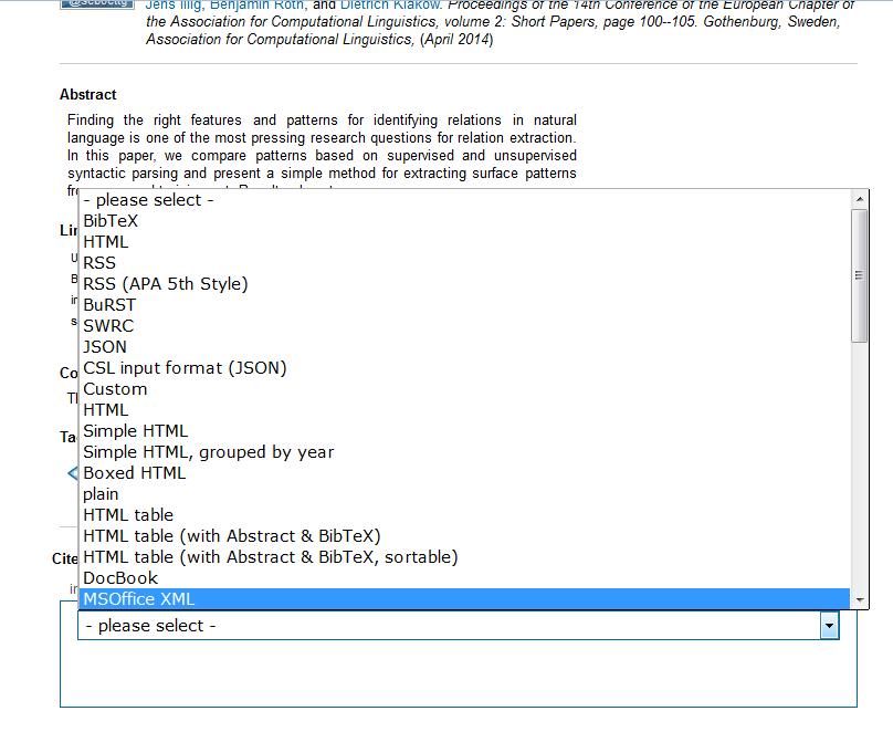
To export a publication, simply select the "MSOffice XML"-Option in the "all formats"-ComboBox and save the xml-file.
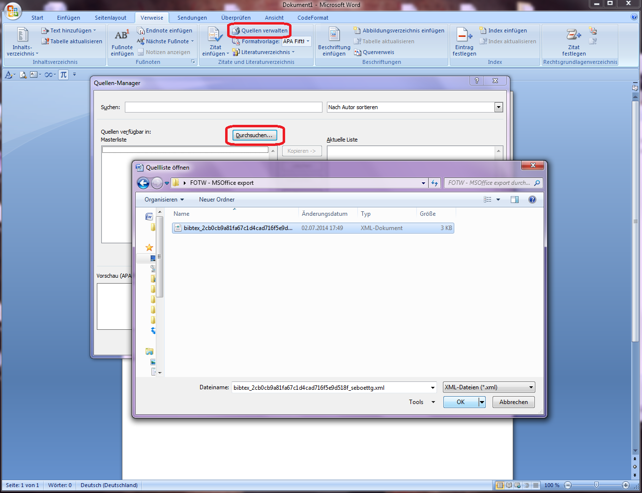
You can also export all your Publications via selecting the "MSOffice XML"-Option on the export page. To import your publications into MS Word open the Reference-Manager, select "Browse..." and open the export xml.
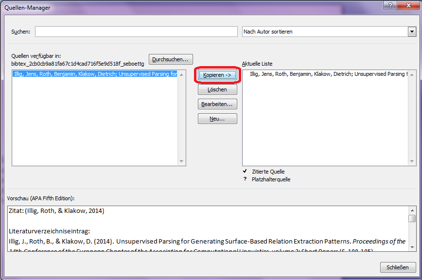
Now you can select the publications you wish to copy into your bibliography on the left side, hit "copy" to add them and finally close the window.
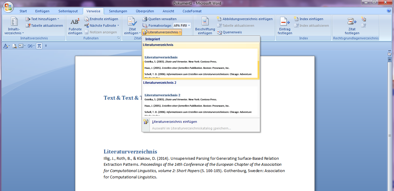
Et voilà!. A click on "bibliography" lets you add the bibliography to your document, including all your previously imported sources.
Happy Tagging
Marcel
To export a publication, simply select the "MSOffice XML"-Option in the "all formats"-ComboBox and save the xml-file.
You can also export all your Publications via selecting the "MSOffice XML"-Option on the export page. To import your publications into MS Word open the Reference-Manager, select "Browse..." and open the export xml.
Now you can select the publications you wish to copy into your bibliography on the left side, hit "copy" to add them and finally close the window.
Et voilà!. A click on "bibliography" lets you add the bibliography to your document, including all your previously imported sources.
Happy Tagging
Marcel
Wednesday, January 29, 2014
Release 2.0.41
Today we relased BibSonomy 2.0.41. Next to some internal fixes and preparations for new features, the release contains:
As always, details follow in our feature of the week posts.
Happy Tagging!
Daniel and Stephan
- the support for Gravatar profile pictures as an alternative to an uploaded picture (see your settings)
- a redesign of BibSonomy's publication details page (e.g., some publication post)
- a new export layout called "Mittelalterliche Geschichte Universität Kassel" (Medieval History, Kassel University)
As always, details follow in our feature of the week posts.
Happy Tagging!
Daniel and Stephan
Thursday, March 8, 2012
In the light of events: BibSonomy's new design
Last week, we did the first step towards our new layout for BibSonomy. Coming up with changes in design had become a necessity over the last years: Change was desired by several of our users and we had noticed increasing difficulty for the integration of new features within the old design.
We have therefore started our redesign, focusing on the post lists and some general elements of the navigation. We plan to continue these efforts for the
- blue header-section (elements like the links to the inbox, clipboard and help have already been moved),
- the sidebar,
- the main menu (for now we have simply restructured the entries)
- and several other pages like the cv page, the posting dialogues or the discussion pages.
As usual, changes in design are of delicate nature. Next to some few general usability criteria, a lot depends on personal taste or on current trends. Two aspects usually come into play and often contradict each other:
- A new design can make a system more open, more easy to use and more understandable for new users.
- A new design always requires adjustments and new orientation from the current users.
For the new design we have received quite some feedback. While much of it was positive, there has also been some criticism. Rest assured that we always take your feedback very seriously; each contribution is carefully debated in our developer meetings.
We are very content about having such an active and dedicated user base and thank everyone who has let us know of their opinion and has provided helpful hints and recommendations.
One of the main aspects for criticism have been the large fixed elements of BibSonomy (like the header and footer section). While such a fixing has certain benefits (e.g., all navigation elements and all information about the visited page is always available) it has caused usability issues on smaller screens as they “eat space”.
Today we reacted by making all elements scrollable again for smaller screens (less than 900 pixel of inner height). Thus - especially on small screens – it will again be possible to use the full height of your screen for the main content. We hope that this will settle most of the screen real estate problems for now. We have made these space issues a priority in our consideration for future improvements. For example, we will squeeze the representation of single posts in one of the following releases (probably by the end of the month). An idea - currently under discussion - is to make the fixing of elements optional with a switch in the user settings.
Another subject of discussion has been the new set of icons. New icons have to be understood and learned. However, icons also have several advantages over textual representations when they are used as metaphors for often-used features:
- Once they are understood, they are more easy to spot and to hit.
- Icons can summarize long text elements using only little space.
- Icons make the site more lively and are usually better received by new users.
- Especially on a page that is long on text anyway, they are well suited to distinguish the content from the functionality.
We are confident that the new icons will be understood quickly and that much of the functionality is now better represented. All icons are labeled (just hover over them) to make the exploration of their function as easy as possible.
Several other issues regarding smaller details have been remarked by some of you. All of them will be considered and each of you who has sent us some hints, wishes or propositions will receive an answer during the next days.
We wish you lots of fun at using the system in its new layout and hope that some of you will even discover some functions they had not been aware of before. As always let us know what you think (blog, twitter, email) - we are always eager to hear your opinion!
Happy tagging
Your BibSonomyCrew
P.S.: As always, Shift-Ctrl-R helps to empty your browser's cache to savor the latest changes.
P.S.: As always, Shift-Ctrl-R helps to empty your browser's cache to savor the latest changes.
Tuesday, February 7, 2012
Feature of the week: Workover of DIN1505 export format
As most of knowledge workers know, a crucial issue when working with scientific references is how to properly format them when creating bibliographies or publication lists. There's so many possibilities - title first, author first, year in brackets, ... and many more. As Germans typically tend to define some standards and norms in such a case, since 1984 there exists the DIN-1505-2 norm (link in German only), which precisely defines a legible standard citation format.
Experienced BibSonomy users will notice that we're offering this export format since quite a while - but in fact, this was a rather simplified variant. Since our last release, our team member Hagen (thanks again!) meticulously examined the DIN-norm and implemented it as a JabRef export layout. If you want to see it in action, choose the "export button" on top of any publication list:
 and choose "DIN 1505" (for the plain layout) or "DIN1505, grouped by year" (for a display grouped by year):
 Here are two examples of the layout in action:
- http://www.bibsonomy.org/layout/din1505/user/dbenz/myown?items=1000
- http://www.bibsonomy.org/layout/din1505year/user/dbenz/myown?items=1000
For those of you who are technically interested: The export layout consists of "typical" JabRef layout template files, along with a number of custom formatters written in Java. Both are publicly available via our Maven repository. We would be happy to get some feedback, if this filter is useful to you! In any case happy tagging & exporting,
Dominik
Sunday, December 11, 2011
Feature of the Week: BibSonomy's new Look
The days at the end of the year are usually a good time to look back on the past 12 months and to take a look ahead to ideas, tasks and challenges for the approaching new year. This week's post is dedicated to the latter and the bigger goal we have set for BibSonomy in 2012 is to give it a new, revised and modern design.
Since its birth in 2005 BibSonomy has been enriched with new features to facilitate and ease the organization of bookmarks and publications, the social interaction with other scientists or getting up to date with the state of the art in science. For some time now, we've felt, that BibSonomy could use a fresh look and a new, reorganized navigational structure, to keep all this functionality together while still being a lightweight and easy-to-use system.
With all that in mind, earlier this year, we started two initiatives: The first one was to set up a project together with our University's department for Human-Machine Systems Engineering. In that project students from different disciplines were asked to use BibSonomy (as first timers) for several tasks that belong the the system's core (like storing and retrieving publications, searching for them or for other users). The participant's behavior was analyzed (e.g., using professional eye-tracking tools) and their feedback collected.
The second initiative was to find a capable designer who could give BibSonomy a fresh, cool look and feel while making functional and intuitive navigational design a key priority. Finally, since changing established workflows and interfaces is usually a delicate matter, another priority was to keep a new design true to the current look and feel.
We are happy to announce that for that task we could win a young designer from Kassel: Daniil Tanygin.
Before we begin to realize a new design, we now want to ask you - our users - for your opinion. Therefore, here are two of the latest sketches Daniil has created for us that show one of the many post-listing sites (e.g., myBibSonomy or home) in BibSonomy:


Any feedback is welcome. We are especially looking forward to your thoughts on the new design ideas and to your own ideas on workflows that you think should be simplified, parts of the page that in your opinion should look different or functions that need to be made more intuitive.
Feel free to state any comment below this post, or send us your feedback via e-mail to webmaster bibsonomy org
Happy tagging
Stephan
Since its birth in 2005 BibSonomy has been enriched with new features to facilitate and ease the organization of bookmarks and publications, the social interaction with other scientists or getting up to date with the state of the art in science. For some time now, we've felt, that BibSonomy could use a fresh look and a new, reorganized navigational structure, to keep all this functionality together while still being a lightweight and easy-to-use system.
With all that in mind, earlier this year, we started two initiatives: The first one was to set up a project together with our University's department for Human-Machine Systems Engineering. In that project students from different disciplines were asked to use BibSonomy (as first timers) for several tasks that belong the the system's core (like storing and retrieving publications, searching for them or for other users). The participant's behavior was analyzed (e.g., using professional eye-tracking tools) and their feedback collected.
The second initiative was to find a capable designer who could give BibSonomy a fresh, cool look and feel while making functional and intuitive navigational design a key priority. Finally, since changing established workflows and interfaces is usually a delicate matter, another priority was to keep a new design true to the current look and feel.
We are happy to announce that for that task we could win a young designer from Kassel: Daniil Tanygin.
Before we begin to realize a new design, we now want to ask you - our users - for your opinion. Therefore, here are two of the latest sketches Daniil has created for us that show one of the many post-listing sites (e.g., myBibSonomy or home) in BibSonomy:


Any feedback is welcome. We are especially looking forward to your thoughts on the new design ideas and to your own ideas on workflows that you think should be simplified, parts of the page that in your opinion should look different or functions that need to be made more intuitive.
Feel free to state any comment below this post, or send us your feedback via e-mail to webmaster bibsonomy org
Happy tagging
Stephan
Wednesday, November 30, 2011
[Feature of the Week] BibSonomy Forecast: Partly (tag)cloudy!
Since its beginning, BibSonomy has undergone several changes - layouts were modified (who of you can still recall the early style from 2005?), new functions were added, internal modules were restructured to enhance performance, and many more. However, throughout these times, the very core of BibSonomy remained the same - namely to be a system to collaboratively annotate (bookmark and publication) resources using freely chosen tags. Despite the fact that the "Web 2.0 hype" is declining since quite some time, the usefulness of free social annotations is reflected e.g. in the usage of tags to organize questions at stackoverflow. So to use a pointed formulation, one could say that tags and their aggregation into tag clouds are a bit like the "heart" of BibSonomy as a social bookmarking platform.
Taking a look back in this way, we decided to polish up our tag clouds a bit. Since the last release, you will have noticed a slight but noticeable change: We've tried to make our tag clouds a bit "cloudier" and nicer. Mainly we've fixed the way how tag sizes are computed (as usually, larger and more visible fonts correspond to more frequently used tags; but we're scaling differently to convey a clearer picture), and changed the alignment. Here is how it looked before:

And here's the new look:

As you can see, it's no revolution, but just a bit nicer and cleaner. But because tags are to close to BibSonomy's (and of course our) heart, we're happy about this neat improvement. We've basically done this for all clouds - this means also for personal or group tag clouds. So we hope you like the new style as much as we do, and you can be even a bit happier when tagging :)
Best,
Dominik
Friday, May 21, 2010
Feature of the Week: The new publication editing dialogue
Our latest major release brought up completely redesigned publication posting and editing dialogues. The changes in the underlying backend system are even bigger than you as end-user might notice. With this week's feature I want to introduce the new dialogue for editing publications.
You can test the dialogue yourself, by copying this post. The emerging web page will look similar to this screenshot where I have highlighted the five main parts I will explain in the following:


This box contains the main fields you must fill out for every publication in BibSonomy: entry type, BibTeX key, title, author(s) or editor(s), and year. For the entry type you can choose among a list of the types supported by BibTeX, i.e., "article", "proceedings", "phdthesis", etc. The BibTeX key uniquely identifies the publication reference in your document and is used to cite the reference (e.g., with the \cite{key} command in LaTeX).
The small blue button next to the BibTeX key allows you to generate a new key - if the one which has been extracted is not easy to remember, for example. We use the first author's last name, the year and the first longer word from the title to generate the key. In the example above the generated key would be "haveliwala2003topicsensitive".

Here you can enter tags (freely chosen keywords) to describe your post and ease later retrieval of it. Since tags are the main ingredient of a social bookmarking system, they are a required field, too. Our tag recommenders help you to find meaningful tags - just click on one of the recommended tags to add them to your post. Hint: you can also click on the tags in your tag cloud on the right side - they are then added to your post, too.

The following two boxes entitled viewable for and relevant for are part of BibSonomy's support for (research) groups.
More on this feature in this blog post.

All other metadata that belongs to a publication is stored in these fields. Note that only the fields that the typical styles for BibTeX use for the selected entry type are shown. You can show all fields by clicking on the respective link at the top of this box.

Here you can enter personal notes or comments about the publication. Why three fields for that?
Well, the first field (description, comment) is not a feature of BibTeX but the description field every post has in BibSonomy - also the bookmarks. Just enter your notes, comments, thoughts on the publication into this field.
The second field (private note) contains your private comments - only you can see its contents.
And the third field (note) is used by BibTeX. Typically, everything you write there is inserted into the publication reference in your literature list.
Actually, sometimes there is a sixth box that is not shown in the above overview screenshot:

This box only appears if you used one of our screen scrapers to post a publication to BibSonomy directly from another digital library like the ones from IEEE or ACM.
The box shows you which scraper extracted the data from which URL and how the extracted BibTeX entry looks like.
Feel free to comment. We are very interested in what you think about the new layout.
You can test the dialogue yourself, by copying this post. The emerging web page will look similar to this screenshot where I have highlighted the five main parts I will explain in the following:

general information

This box contains the main fields you must fill out for every publication in BibSonomy: entry type, BibTeX key, title, author(s) or editor(s), and year. For the entry type you can choose among a list of the types supported by BibTeX, i.e., "article", "proceedings", "phdthesis", etc. The BibTeX key uniquely identifies the publication reference in your document and is used to cite the reference (e.g., with the \cite{key} command in LaTeX).
The small blue button next to the BibTeX key allows you to generate a new key - if the one which has been extracted is not easy to remember, for example. We use the first author's last name, the year and the first longer word from the title to generate the key. In the example above the generated key would be "haveliwala2003topicsensitive".
tags

Here you can enter tags (freely chosen keywords) to describe your post and ease later retrieval of it. Since tags are the main ingredient of a social bookmarking system, they are a required field, too. Our tag recommenders help you to find meaningful tags - just click on one of the recommended tags to add them to your post. Hint: you can also click on the tags in your tag cloud on the right side - they are then added to your post, too.
groups

The following two boxes entitled viewable for and relevant for are part of BibSonomy's support for (research) groups.
viewable for
You can restrict which users can see this post. Either everybody ("public"), only you ("private"), or your friends ("friends"). If you are member of a research group, you can also allow only members of the group to see the post. We will soon allow posts to be visible for several such groups.relevant for
As member of a group you can explicitly state that the post is relevant for this group. Such posts then appear on the /relevantfor page, e.g., for the group kde on the page /relevantfor/group/kde.More on this feature in this blog post.
detailed information

All other metadata that belongs to a publication is stored in these fields. Note that only the fields that the typical styles for BibTeX use for the selected entry type are shown. You can show all fields by clicking on the respective link at the top of this box.
comments and notes

Here you can enter personal notes or comments about the publication. Why three fields for that?
Well, the first field (description, comment) is not a feature of BibTeX but the description field every post has in BibSonomy - also the bookmarks. Just enter your notes, comments, thoughts on the publication into this field.
The second field (private note) contains your private comments - only you can see its contents.
And the third field (note) is used by BibTeX. Typically, everything you write there is inserted into the publication reference in your literature list.
scraper information
Actually, sometimes there is a sixth box that is not shown in the above overview screenshot:

This box only appears if you used one of our screen scrapers to post a publication to BibSonomy directly from another digital library like the ones from IEEE or ACM.
The box shows you which scraper extracted the data from which URL and how the extracted BibTeX entry looks like.
To sum up ...
In our opinion, the new dialogue is much cleaner and easier to use than the old one. All the important facts about a publication are grouped together at the top of the page. Furthermore, now the two dialogues for editing bookmarks and publications have a consistent layout which eases usage of the system.Feel free to comment. We are very interested in what you think about the new layout.
Wednesday, January 20, 2010
New Release
Yesterday we deployed a new release which mainly contains bugfixes and a big cleanup in the underlying database module. It already contains the backend methods for some new features, e.g., the Inbox. During this week we will also try to switch the full text search to Lucene.
A small new feature which has been added is the layoutinfo JSON which provides metadata about the available JabRef layouts (you can see this currenly on the export page). This will be used by our Typo3 plugin to provide a selection of available layouts.
A small new feature which has been added is the layoutinfo JSON which provides metadata about the available JabRef layouts (you can see this currenly on the export page). This will be used by our Typo3 plugin to provide a selection of available layouts.
Tuesday, December 16, 2008
Feature of the week: Bibsonomy's new Layout
As you probably already noticed: BibSonomy got a new outfit. We will summarize how look & feel of your (still) blue social bookmark and publication sharing system has changed.
Navigation
Little changed with respect to BibSonomy's menu navigation, though, due to extensive use of cascading style sheets (CSS), overall navigation is more consistent and obvious in comparison with the old layout.
Whenever a menu item is linked to a sub menu, a downward triangle is displayed left to the corresponding item. The main menu realizes tab-like navigation: While visiting a certain page, the corresponding menu item is displayed in the front.

Tag clouds
The picture above also shows the new tag cloud representation: The higher a tag's frequency, the bigger its font size and more intense its color.
List views
Each list view which shows publications as well as bookmarks offers the possibility to expand one of it's columns. This feature can be found on the top right:
 Double column view is restored by activating the '|' link at the same place.
Quick-Post
You can tag any post displayed by your own by clicking on the star on the right of the corresponding entry in a list view. A solid blue star indicates that you already tagged the resource.
Internationalization
Internationalization of BibSonomy is still in progress. Whenever available, different languages can be chosen by clicking on the corresponding flag at the top right corner.

...and all the rest
Not each element's new layout has been introduced here (e.g. the new groups listing, just to mention one). Have a look by yourself and enjoy BibSonomy's new layout.
Errors tend to happen, though we try our best to avoid them. If you encounter any incorrectly rendered elements, please let us now by sending an email (see our contact page for further details).
.folke
Navigation
Little changed with respect to BibSonomy's menu navigation, though, due to extensive use of cascading style sheets (CSS), overall navigation is more consistent and obvious in comparison with the old layout.
Whenever a menu item is linked to a sub menu, a downward triangle is displayed left to the corresponding item.
 The main menu realizes tab-like navigation: While visiting a certain page, the corresponding menu item is displayed in the front.
Tag clouds
The picture above also shows the new tag cloud representation: The higher a tag's frequency, the bigger its font size and more intense its color.
List views
Each list view which shows publications as well as bookmarks offers the possibility to expand one of it's columns. This feature can be found on the top right:
 Double column view is restored by activating the '|' link at the same place.
Quick-Post
You can tag any post displayed by your own by clicking on the star on the right of the corresponding entry in a list view. A solid blue star indicates that you already tagged the resource.
Internationalization
Internationalization of BibSonomy is still in progress. Whenever available, different languages can be chosen by clicking on the corresponding flag at the top right corner.

...and all the rest
Not each element's new layout has been introduced here (e.g. the new groups listing, just to mention one). Have a look by yourself and enjoy BibSonomy's new layout.
Errors tend to happen, though we try our best to avoid them. If you encounter any incorrectly rendered elements, please let us now by sending an email (see our contact page for further details).
.folke
Subscribe to:
Posts (Atom)
Popular Posts
-
 A while ago we were asked on Twitter about a Twitter integration for BibSonomy (by the way follow @BibSonomyCrew on Twitter for the latest ...
 -
Two important aspects of working with literature are the process of sharing it among your colleagues and the exchange of ideas and thoughts ...
-
Dear BibSonomy users, right in time for Christmas / Holidays we finished our work on BibSonomy Version 3.9....
-
Dear BibSonomy users, again right in time for Christmas / Holidays we finished our - extensive - work on BibSonomy Version 4.1.0 and release...

