As we are about to release a new design for BibSonomy, we would like to show you a bit of the beginnings of our system. When it started out in 2006 the website looked a lot like today and still totally different:
The first publication on BibSonomy was also published in 2006 as was the very first blog post.
At the moment we are testing the new bootstrap layout, which will hopefully be released soon:
So stay tuned and keep tagging!
Lena
Thursday, August 21, 2014
Wednesday, August 13, 2014
Release 2.0.46
Hello BibSonomy folks,
today marks the release of BibSonomy 2.0.46. We integrated a bunch of new publication scrapers:
today marks the release of BibSonomy 2.0.46. We integrated a bunch of new publication scrapers:
- MDPI (http://www.mdpi.com)
- Oxford Journals (http://www.oxfordjournals.org)
- The Lancet (http://www.thelancet.com)
Aside from this, we fixed a number of small bugs such as a bug with tag recommendations. We updated the JabRef layouts and worked hard on the new layout. The layout is still in closed beta and will see its release in a future version.
Happy tagging
Thomas
Wednesday, August 6, 2014
Feature of the Week: Developers Corner
As part of our process to open BibSonomy up for developers, we have re-designed the BibSonomy start page at Bitbucket:
The three blue boxes provide quick access to pages about developing for and with BibSonomy, integrating BibSonomy with other tools and services, and using BibSonomy for research. They help you to easily find the information you need. The three grey boxes at the bottom provide further information, e.g., news about BibSonomy, who's behind BibSonomy, and where to find help.
In addition, the API documentation has been greatly improved during the last weeks. All developers definitely should have a loon on it and on the other relevant wiki pages.
Have a look at the new page and as always ... happy tagging!
Sunday, August 3, 2014
BibSonomy gets a new front-end
We're currently working hard on a new user interface for BibSonomy. In the past, we've had lots of hints on how to optimize the layout, accessibility, and usability. We're scientists and programmers but we aren't product designers or experts of human computer interaction. So we've decided to use a framework that helps us to implement all these necessary improvements.
There are lots of front-end frameworks out there. We’ve chosen Bootstrap for the following reasons:
The aim of a new front-end is to achieve an easier way to interact with BibSonomy. For this, we’ve defined a few rules, which we try to implement with the switch to Bootstrap.
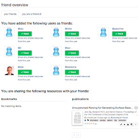
Finally, I would like to give you some insights in the new front-end:
There are lots of front-end frameworks out there. We’ve chosen Bootstrap for the following reasons:
- Bootstrap is open source and freely available
- It supports responsive web design. It is very hard for a community of an open source project to develop and maintain two front-ends. With Bootstrap we develop code once-only and it works for computer screens, tablets (like the iPad), and smartphones
- Bootstrap is widely used. The look and feel of all elements is familiar.
- And of course, it looks great ☺
The aim of a new front-end is to achieve an easier way to interact with BibSonomy. For this, we’ve defined a few rules, which we try to implement with the switch to Bootstrap.
- Give all elements room to breathe! Currently, there are too many control elements spread over areas that are too small.
- Use larger fonts! Large fonts create larger clearness and better readability on mobile devices.
- If possible, use existing standard elements of Bootstrap. The elements of Bootstrap are approved and established. They are tested on different devices and browsers.
- Help the user where he/she needs help. With the last front-end redesign, we have added a lot of help and hints. Now we want to use it so it supports the user even better.
- Keep navigation menus clear. Easier menu structures helps users to find what they are looking for.
Finally, I would like to give you some insights in the new front-end:
 |
| post list and the new user menu |
 |
| Publication details page |
 |
| friends overview page |
 |
| Mobile view |
 |
| Tablet view |
 |
| View for computer screens |
We hope you like what you see. More information and release dates coming soon.
Keep happy and tagging!
Sebastian
Keep happy and tagging!
Sebastian


